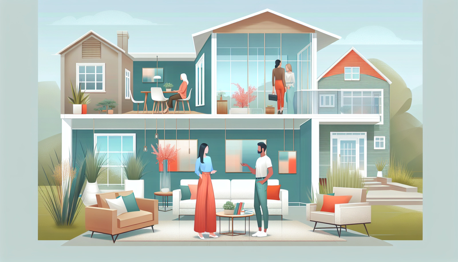
As a local real estate professional with deep South Jersey roots, Dennis Mark Interdonato at Dennis Interdonato | Keller Williams Realty Ocean Living helps Vorhees (formally Voorhees Township) homeowners maximize their home’s market appeal long before the first showing. A fresh, well-chosen paint palette is one of the fastest, most affordable ways to boost buyer interest and perceived value in Vorhees, New Jersey. Below is a practical, hyper-local guide to choosing interior and exterior colors that resonate with today’s Vorhees buyers—grounded in on-the-ground experience across neighborhoods like Sturbridge Lakes, Alluvium, Beagle Club, Main Street, and the Voorhees Town Center area.
In Vorhees, New Jersey, buyers expect move-in-ready homes that photograph beautifully and feel cohesive during showings. Neutral, well-applied paint calms visual noise from older finishes and makes spaces feel larger and brighter—critical for homes built in the 1970s–1990s with traditional floor plans common in Alluvium and Beagle Club, as well as townhomes and condos around Main Street and Victoriana. Fresh paint also signals diligent maintenance, which can help shorten time on market. While no single color guarantees a price premium, professional, neutral repainting often increases showing traffic and strengthens offers by helping buyers focus on the home’s floor plan, natural light, and location near top amenities like Connolly Park, Virtua Voorhees Hospital, and the Voorhees Town Center.
The right palette complements South Jersey’s four-season light, local architectural styles (colonials, contemporary townhomes, and lake-community properties in Sturbridge Lakes), and the mature tree canopy that casts cool shade on many streets. Prioritize light, warm-leaning neutrals that brighten interiors during gray winters and humid summers, pair with common finishes like medium oak flooring or espresso-stained cabinets, and play nicely with stone or brick accents found on many Voorhees exteriors. Consistency across common areas, combined with strategic depth in kitchens and baths, maximizes ROI while minimizing repaint costs.
Neutral tones—think greiges, warm grays, and soft beiges—dominate successful listings throughout Vorhees and neighboring Marlton, Berlin, and Cherry Hill. They make rooms feel larger, accommodate a wide array of furniture styles (from modern farmhouse to traditional), and reduce the number of objections buyers raise during showings. In communities with mixed-age housing like the Voorhees Town Center area, a neutral base also unifies different updates across rooms and levels.
A neutral canvas allows buyers to visualize their lifestyle—hosting friends after a stroll at Connolly Park’s dog park, commuting via PATCO from Lindenwold, or enjoying summer evenings by the water in Sturbridge Lakes. It reduces the “project list” buyers might mentally tally, which is especially helpful for relocation buyers shopping quickly from Philadelphia or North Jersey.
Highly saturated accent walls, deep reds, or intense purples can polarize buyers and make MLS photos read darker, particularly in rooms with limited natural light (common in north-facing spaces shaded by mature oaks). If you love bold color, keep it to easily changed decor. For walls, cleaner neutrals protect your selling timeline and budget.
Undertones—subtle hints of yellow, green, pink, or blue—determine whether a neutral looks dingy, cold, or perfectly balanced. Vorhees homes often feature mixed lighting: cool northern light in front rooms, warm afternoon sun in backyards, and shaded interiors due to trees near Kirkwood Lake and along residential streets. The same color can shift drastically; testing undertones on multiple walls at different times of day is essential.
Many Voorhees homes have mid-tone wood floors, cream trim, and stone or brick elements. Greiges with mild green or taupe undertones harmonize with brick and natural stone; warm grays suit espresso cabinetry; soft beiges flatter traditional millwork. Avoid pink-beige undertones next to orange-toned floors; they can amplify unwanted warmth.
Recently sold homes in Alluvium and Beagle Club frequently feature light greige main levels, crisp white trim, and soft off-white kitchens. Newer townhomes near the Voorhees Town Center favor clean, modern palettes with warmer whites and very light greiges to maximize smaller footprints. Lake-community homes in Sturbridge Lakes lean into organic, nature-complementary tones.
While your personal style matters, aim for broad-market appeal. If most comparables in your part of Voorhees show neutral palettes and white kitchens, follow suit to remain competitive. Dennis monitors local buyer feedback weekly and can advise when a bolder trend actually gains traction—or when it’s best left to interior design blogs.
In our market, the winner is often “greige”—a blend of gray and beige—because it’s flexible. Pure gray can read too cool during gray Mid-Atlantic winters, while pure beige may skew dated alongside modern fixtures. Greige threads the needle and photographs exceptionally well.
Warm grays with soft taupe undertones are forgiving with both oak and darker floors, complement stainless appliances, and play nicely with black hardware that’s popular in recent renovations across Voorhees. They also temper strong afternoon sun common in west-facing living rooms.
Consider these tried-and-true options for broad appeal: - Soft greige: Light, balanced greige that works from foyer to family room. - Warm gray: A touch deeper than greige for definition in open plans. - Light beige with modern undertone: For very shaded interiors that need warmth. - Trim and ceilings: A clean, soft white with slight warmth keeps spaces bright without starkness.
Extend your main-level wall color into the kitchen to maintain flow—especially in traditional Voorhees colonials where the kitchen connects to the breakfast area and family room. This continuity helps MLS photos feel composed and upscale.
If your cabinets are white or off-white, slightly deepen the wall color (one shade darker than the common areas) to create contrast, or introduce a gentle blue-green gray behind open shelving. If your cabinets are dark espresso, keep walls lighter to prevent a heavy feel.
Painting dated oak or cherry cabinets can modernize the entire home. Soft whites with warm undertones suit the South Jersey light; two-tone schemes (white uppers, deeper island in navy or charcoal) work well if the rest of the house remains neutral. Replace or update hardware to matte black or brushed nickel for a finished look. Always use high-quality enamel and proper prep—Dennis can connect you with reputable Camden County painters who know how to achieve a factory-like finish.
Buyers in Voorhees often prioritize bedroom count and tranquility—proximity to Eastern Regional High School and Voorhees Middle School draws families who scrutinize these spaces. Calm, light colors help rooms feel restful and spacious.
Bedrooms are typically straightforward repaint projects with strong returns. Use the main-level neutral or a lighter shade for secondary bedrooms; reserve slightly deeper, soothing tones for the primary suite to add subtle luxury without straying from a market-friendly palette.
Because natural light varies by street and tree cover—from Alluvium’s larger lots to townhomes near the Voorhees Town Center—Dennis recommends testing samples on at least two walls per bedroom. He provides on-site or virtual color consultations tailored to your floor plan and lighting conditions.
Bathrooms allow a bit more character while staying sale-focused. Soft spa hues—muted blue-grays or green-grays—work especially well when paired with white tile or quartz. In compact powder rooms, go a shade richer to create a polished, boutique feel.
First impressions set the tone before a buyer even steps inside. With mature landscaping across much of Voorhees and seasonal pollen, a clean, coordinated exterior palette stands out in photos and drive-bys. Fresh paint can neutralize dated siding colors and tie together brick or stone with trim and shutters.
Respect neighborhood aesthetics and any HOA guidelines—particularly in Sturbridge Lakes and certain planned communities. Earthy taupes, soft greige, and muted green-grays blend beautifully with wooded lots and lake views. For brick-front colonials, pair the brick with warm gray or taupe body colors, crisp white trim, and restrained shutter colors.
A front door is the perfect place for personality without risking resale. Classic black, deep navy, or rich red complement many Voorhees homes. In lake settings or heavily wooded streets, a sophisticated teal or slate blue-green can feel tailored and local. Keep hardware clean and updated—matte black or brass reads upscale against both light and dark doors.
Practical local tips: - Shade and moisture from tree cover can encourage mildew on the north side—choose exterior paints with mildewcides and wash annually. - The freeze-thaw cycle can crack failing caulk; ensure joints and trim are caulked and primed before painting. - If your home predates 1978 (more common in the Kirkwood area), assume possible lead-based paint on exterior trims and hire EPA-certified pros.
How Dennis Mark Interdonato Maximizes Your Paint ROI in Vorhees, New Jersey
Recommended Starting Palette for Most Vorhees Listings
Final Word
In Vorhees, New Jersey, thoughtful paint choices do more than refresh a home—they strategically position your property to outshine the competition from Cherry Hill to Marlton. Whether you’re preparing a brick-front colonial in Beagle Club, a lake-view home in Sturbridge Lakes, or a townhome near the Voorhees Town Center, Dennis Mark Interdonato brings neighborhood-specific insight, reliable resources, and a marketing-minded eye to every color decision. If you’re considering a sale this season, reach out to schedule a quick walk-through and personalized color plan—so your home hits the market looking its absolute best and attracting the right buyers from day one.
Keep reading other bits of knowledge from our team.
Have a question about this article or want to learn more?