If you’re preparing to sell in Whiting, New Jersey, a smart paint plan can be one of the most cost-effective ways to boost buyer interest and final sale price. As a longtime local agent, Dennis Mark Interdonato with Dennis Interdonato | Keller Williams Realty Ocean Living has helped sellers across Whiting’s 55+ communities like Crestwood Village and Whiting Station, as well as single-family neighborhoods near Route 530 and Route 70, choose colors that photograph beautifully, feel welcoming at showings, and align with Ocean County buyer expectations. The right palette softens dated finishes, brightens pine-shaded interiors, and creates a cohesive look that makes homes feel move-in ready—an especially strong selling point in Whiting’s competitive, value-focused market.
Paint is one of the few upgrades that meaningfully raises perceived value without a major investment. In Whiting, where many buyers are relocating from North and Central Jersey or the New York metro area for a simpler, low-maintenance lifestyle, “turnkey” is the word that drives action. Fresh, neutral paint communicates that a home has been cared for, reducing mental “to-do” lists and increasing the likelihood of strong offers. It also photographs far better for online listings—a critical advantage when buyers are comparing homes from afar.
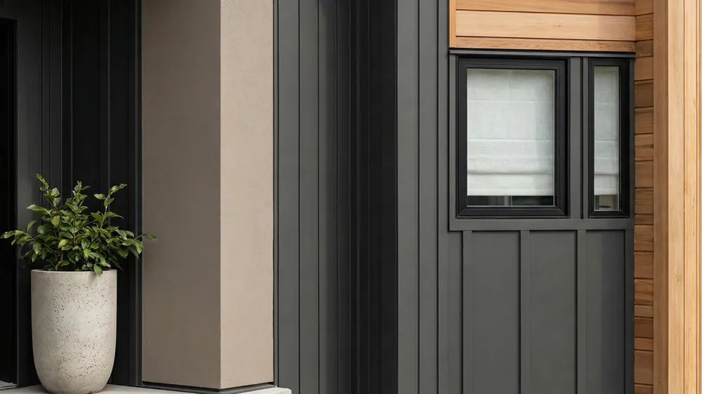
For the best return, use soft, contemporary neutrals that unify the entire home, then layer in subtle contrast where it counts: trim, doors, and key accent walls. In Whiting, light can be filtered by tall pines and homes often have smaller windows, so colors with a higher Light Reflectance Value (LRV) help spaces feel brighter and larger. A well-chosen greige (a blend of gray and beige) can harmonize with older tan granite, honey oak or medium cherry cabinets, and tile common in many Whiting homes, while still reading updated and fresh.
Neutral tones—think warm grays, soft beiges, and airy off-whites—match Whiting buyer preferences. Many purchasers are moving into active adult communities like Crestwood Village or Pine Ridge at Crestwood and are seeking calm, restful interiors. Neutrals appeal across tastes, work with a variety of furnishings, and make it easy for buyers to imagine their belongings in the space.
A unified neutral palette adds flow, especially in ranch-style layouts and manufactured homes common in Whiting. Paint common areas, hallways, and adjoining spaces in a single color family so rooms feel connected. Use bright white trim to sharpen lines and make architectural details pop. This approach is especially helpful if your home gets softer, pine-filtered light.
Bold colors can shrink rooms and limit buyer imagination. Vibrant reds, deep purples, or intense yellows often read as “paint job needed,” which can lead to lower offers. If you love color, limit it to small, easily repainted accents like a powder room or front door and ensure it complements the broader neutral scheme.
Undertones—whispers of beige, green, blue, or pink within a color—become more noticeable in Whiting’s variable light. North-facing rooms and spaces shaded by pines may make colors appear cooler and darker. South-facing rooms can amplify warmth. Test large swatches on multiple walls and observe morning to evening.
Many Whiting homes feature tan-speckled granite, cream tile, medium oak cabinetry, or honey-toned floors. Greiges with a warm undertone (not blue or purple) pair best. If your home has cooler finishes, such as gray plank flooring or white shaker cabinets, a soft neutral with a subtle green or violet undertone can keep things balanced without feeling cold.
• Warm undertones (beige/cream) add coziness in shaded rooms.
• Cool undertones (hint of blue/green) can crisp up sun-drenched spaces and modern finishes.
• True neutral undertones are excellent when listing photos are a priority, as they reflect light cleanly.
Recent successful listings around Whiting Station, Crestwood Village, and Country Walk at Whiting skew toward soft greiges and off-whites—timeless and clean. Buyers consistently favor move-in ready looks over highly personalized schemes.
If your association has design standards, comply with them while staying market-forward. Inside, keep personalization minimal. Outside, follow HOA-approved palettes but look for subtle upgrades—a crisper trim white or a refreshed shutter color.
Ranch homes and 55+ community cottages look best with simple, harmonious palettes. Avoid choppy, high-contrast combinations that break up modest-sized spaces. For larger single-family homes along the Route 70 corridor, soft, coastal-inspired neutrals read well without feeling “beachy.”
Gray once dominated; beige is timeless. In Whiting, the winner is often greige—a balanced middle that feels current and looks good with both warm and cool finishes. Greige hides minor wall imperfections and helps smaller rooms feel connected.
Warm grays bring sophistication without the sterility of cooler grays. They play well with tan tile, oak cabinets, and older countertops still prevalent in the area. They also photograph beautifully, a must for online marketing.
Consider these proven, buyer-friendly choices:
• Greiges: Sherwin-Williams Agreeable Gray, Benjamin Moore Edgecomb Gray, Benjamin Moore Pale Oak
• Light grays: Sherwin-Williams Repose Gray, Benjamin Moore Classic Gray
• Soft beiges/off-whites: Benjamin Moore Swiss Coffee, Benjamin Moore White Dove (as wall or trim), Sherwin-Williams Alabaster (more off-white)
Finish: Use eggshell for walls in living/dining/halls for subtle sheen and easy maintenance; semi-gloss for trim to highlight door frames and baseboards.
Carry the main living-area color into the kitchen for flow. If cabinets are stained wood, a soft greige on the walls will update the look without fighting the grain. If your kitchen opens to the dining area, consistent color makes both spaces feel larger.
If you want a softer contrast, consider a slightly lighter or darker shade of the main color on one kitchen wall or the breakfast nook. If your counters are tan-speckled granite (common in many Whiting updates), avoid cool blue-grays that can clash; instead, aim for warm neutrals like Edgecomb Gray or Pale Oak.
White cabinets are a safe, high-ROI choice. Crisp whites like Benjamin Moore Chantilly Lace or Sherwin-Williams Pure White modernize older kitchens instantly and brighten pine-shaded rooms. If you prefer color, try a soft greige on lowers (e.g., Benjamin Moore Revere Pewter) with white uppers to keep things airy. Update hardware in matte black or brushed nickel for a clean, current look.
Tip: In humid Ocean County weather, use a durable, scuff-resistant cabinet enamel and allow ample cure time.
Bedroom calm matters in Whiting, especially for buyers prioritizing relaxation and easy living. Soft, restful hues help rooms feel larger and more serene, especially in homes with smaller bedroom footprints common in 55+ layouts.
Repainting bedrooms typically delivers excellent value. Neutralize bold or dated colors, cover any nicotine staining (common in older homes) with a stain-blocking primer, and keep palettes consistent with the main living areas. Expect that a well-executed bedroom repaint can make a home feel 10 years younger to buyers—without major expense.
Top picks for Whiting bedrooms:
• Soft neutrals: Benjamin Moore Balboa Mist, Sherwin-Williams Crushed Ice
• Restful tints: Sherwin-Williams Sea Salt (green-gray), Benjamin Moore Gray Owl (soft cool gray), Benjamin Moore Healing Aloe (airy green)
Keep trim fresh white for a clean hotel-like feel.
Bathrooms are a great place to add subtle personality without scaring buyers. Because these rooms are small, lighter tones help them feel larger, while a slightly richer accent can elevate a dated vanity or tile.
Work with existing tile: cream or tan tile loves warm grays and soft beiges; cooler gray tile pairs with pale blue-greens. Replace heavy shower curtains with light, neutral fabric to amplify your paint choice.
Consider:
• Light and spa-like: Sherwin-Williams Sea Salt, Benjamin Moore Beach Glass
• Clean and neutral: Benjamin Moore Classic Gray, Sherwin-Williams Passive (soft cool gray)
Use satin or semi-gloss in baths for moisture resistance, and apply a quality mildew-resistant paint given Ocean County’s humidity.
Curb appeal is non-negotiable. In Whiting, pollen from surrounding pines and shade on north-facing sides can make exteriors look dull or dingy. Before painting, power-wash siding and address any mildew. A crisp, clean exterior sets the stage for strong first impressions when buyers drive through communities like Whiting Station or Crestwood Village.
Choose colors that complement neighborhood styles and, if applicable, your association guidelines. Soft greiges, taupes, and light sages feel at home against Whiting’s natural, wooded backdrop. Pure, stark whites can look harsh outdoors; a warm off-white is more forgiving and blends well with common roof colors in the area.
A tasteful door color can energize the façade, especially when the rest of the palette is understated. Navy, deep green, or classic black look timeless and upscale. If your neighborhood skews traditional, avoid overly bright colors; instead, choose saturated, elegant tones that photograph beautifully.
Consider:
• Body: Sherwin-Williams Accessible Beige, Sherwin-Williams Colonnade Gray, Benjamin Moore Revere Pewter (reads warmer outside), Benjamin Moore Natural Cream
• Trim: Benjamin Moore White Dove, Sherwin-Williams Alabaster (warm whites that stay soft in bright sun)
• Shutters/Accents: Sherwin-Williams Iron Ore (charcoal), Benjamin Moore Kendall Charcoal (deep gray-brown)
• Front Door: Benjamin Moore Hale Navy (navy), Sherwin-Williams Tricorn Black (black), Benjamin Moore Essex Green (deep green)
Practical exterior tips for Whiting:
• Use paint with added mildewcide on shaded sides of the home.
• If you have vinyl siding, choose vinyl-safe colors and verify expansion ratings.
• Check HOA rules in communities like Crestwood Village and Whiting Station—many have approved exterior palettes and sheen requirements.
• Update the mailbox and house numbers to match new paint for a cohesive, finished look.
Final Local Selling Tips from Dennis Mark Interdonato
Why work with Dennis Interdonato | Keller Williams Realty Ocean Living?
Dennis Mark Interdonato brings a Whiting-first perspective to color selection, staging, and marketing. He understands what resonates with buyers in Crestwood Village co-op homes versus fee-simple properties, how to align with association guidelines without sacrificing style, and which hues consistently help Ocean County listings sell faster and at stronger prices. From on-site lighting assessments to curated color boards that complement your finishes, Dennis provides practical, actionable guidance that turns a paint job into a strategic marketing tool.
If you’re thinking of selling in Whiting, New Jersey, a thoughtfully chosen color plan can be the easiest way to elevate your home’s appeal. With the right neutral palette, well-chosen undertones, and an exterior refresh that fits neighborhood character, you’ll meet buyer expectations from the first online photo to the final walk-through—and maximize your return in the process. For a personalized paint and preparation plan tailored to your Whiting property, reach out to Dennis Mark Interdonato at Dennis Interdonato | Keller Williams Realty Ocean Living.
Keep reading other bits of knowledge from our team.
Have a question about this article or want to learn more?